LOOKING AT ENERGY FROM ABOVE FOR EARTH HOUR
FRIDAY, APRIL 8Switch off the lights and get your candles ready because Earth Hour happens tomorrow, Saturday, March 25, from 8:30 to 9:30 in your local time-zone. During the event, WWF invites you and over a billion people worldwide to turn off your lights in support of a global environmental cause.
In honour of this year’s Earth Hour, we’re giving you a glimpse of our world’s energy circumstance from above.
Have you ever pondered where your electricity comes from, who uses the most of it in the world, or where all of the world’s nuclear reactors are? Well, scroll down to find out!
1- Here’s a map of what the Earth looks like at night. The brightest areas on the map show the Earth’s most developed and urbanized areas, but not necessarily the most populated. Can you spot where you live on the map?
In 2008, the U.S. Environmental Protection Agency cited that emissions from electricity generation accounted for the largest portion of greenhouse gas emissions over agriculture, commercial, industrial, residential, and transportation categories. Transitioning these categories to dependence on renewable energy like solar panel technology can make great strides in solving this.
2- This map from the UK Guardian shows the world’s carbon emissions by country as of 2006. Over this period, China overtook the United States as the largest emitter of C02. Click on the map below to explore the interactive version where you can learn more about each continent.
3- If you’ve ever wondered where the world’s electricity comes from, the chart below shows the total world electricity generation by type of fuel as of 2008. Coal still fuels over 40% of electricity worldwide. The ‘other’ category includes solar, and other technologies.
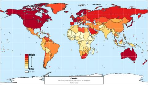
4- These maps show electricity consumption. The first map shows total electricity consumption, and the second one shows electricity consumption per capita. Where do you fit in? Find your country’s ranking in a complete list of countries by electricity consumption by clicking on the maps below.
Electricity consumption per capita:
Map courtesy of World Sites Atlas
5- This map gives you an idea of where nuclear power stations are located worldwide (represented by blue markers). As of the year 2000, there are 248 recorded atomic energy plants. MapTD, a blog about maps, overlaid 37 years of seismic activity in response to the recent nuclear scares in Japan. Click on the image below for an interactive map to learn more about global reactors.
6- What if we could generate all of our electricity through solar photovoltaics (solar panels)? The map below shows the total surface area needed to generate all of the world’s electricity by solar panels. The small red and yellow rectangles represent land area needed to meet the world’s electricity needs by the year 2030. Click on the map below for a larger version with detailed information.
Written by: RJ Taylor